

So you built your beautiful web page with Elementor, and now you are a little bit shocked after viewing your page on mobile for the first time.
Sections are stretched and lots of white space is added, that leads to lots of scrolling, images take up large parts of the site, the font size is too large, and so on. In short, your page is barely usable on mobile devices and you need to work on the responsiveness of your page.
It looks like a lot of work to fix all this. The reality is if you apply a few mobile-specific settings you will land at an okay-ish page within minutes.
This list of tips is the result of building lots of pages with Elementor for our clients (and our own, of course).
Change Padding and Margin Settings for mobile
The number one thing you should fix is the padding and margin settings for your sections and columns. Elementor does not automatically reduce or compute a fitting margin/padding setting for your page.
Let’s take a look at an example. In this screen-recording, you can see our contact section from our frontpage. There are multiple paddings and margins applied on section and column level. If I switch to mobile you can see that the margin and padding settings are empty and that it looks ugly on mobile.
What I recommend is the following:
- Switch to mobile view
- Set padding and margin to zero for all sections/inner section and columns
- Add margin on the main section holding the content
- Then start adding paddings on content columns (i.e. 5%).
As you can see in the example above, with a few small edits the page looks better on mobile within seconds. Keep in mind that it is important to apply the exact same paddings and margins for all sections and columns for mobile, that will lead to a consistent experience.
Change the order of columns
Sometimes it looks weird when the exact same order of content is applied on mobile. For our contact section, I do not want to have my picture shown first. Elementor comes with a handy feature to change that.
On the inner section holding the two columns, I can edit the responsive property under advanced. The magic slider is called reverse columns.
Avoid responsive settings on widget level when possible
Elementor is powerful by providing the possibility to position every element as you like. You can customize paddings and margin on all elements.
In addition, you can also hide individual elements. To come back to my previous example I could decide to hide my picture on mobile completely.
I would argue you should be cautious of using these powerful features to often. Every time you edit your page you have to think of desktop/tablet/mobile separately. Especially on large pages editing can get quite complicated.
Whenever possible, avoid hiding elements on the widget level. You may have a page with 50 or more content widgets, managing the responsive settings individually can create lots of overhead.
If there is no other way of getting your page mobile-ready, go for it.
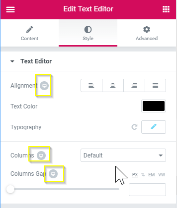
Change content alignment and font sizes for mobile
In some cases, it can make sense to center content on mobile.
Take for example this newsletter/social follow bar. It looks great on the desktop with content left-aligned, but on mobile not so much.
With a few clicks, you can center the content on mobile only.
The Typography settings are another source of potential issues on mobile. The style of headline and text widgets can be customized. Most importantly is font size, but all other typography properties are customizable too.
Change background style settings
If you work with background images on sections you might realize that it does not look good on mobile. There are several ways to customize background images:
- Change the positioning of the image on mobile
- Or you could upload a resized version of the image for mobile
- Or remove the background image on mobile by uploading a transparent graphic for mobile
Take for example the hero area of our homepage. The desktop settings for the background image do not fit for mobile, with a few clicks you can change how the image is positioned on mobile.
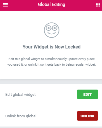
Work with templates, global widgets and “global sections”
If you work on a WordPress website that uses Elementor for multiple pages, get used to working with templates, global widgets or global sections/templates.
Global widgets allow you to re-use elements across your site. Once a widget has the perfect settings for desktop, tablet, and mobile you can re-use it across your site, and later easily change it centrally.
Templates are great for re-using style settings and in combination with the Elementor Pro widget “templates” a great way to reuse globally on your site.
I have written a detailed guide that explains how to use global widgets and templates (global sections).
Don’t ignore tablet users completely
Yes, tablet traffic is low on your page, tablets are lying on our couches most of the time.
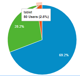
If you have ten thousand unique users a month and you got 5% tablet traffic that is still 500 users, keep that in mind and do quick customizations for tablet users too.
Check out all responsive settings
In this post, I have mentioned the tricks for making your site responsive quickly, but there are many more ways to customize your sites responsiveness.
The best way to learn about all the possibilities you get with Elementor is to always look out for the responsive switch menu.
These are the settings you will touch most often to make your site responsive:
- Hide/show elements on mobile/tablet/desktop
- General layout:
- Margins and padding
- Column width
- Reverse columns
- …
- Change the style of widgets
- Font size and typography settings
- Alignment
- Background style settings
- Remove/change animations
- …
Also, check out the official Elementor docs for mobile editing.
Should you get Elementor Pro?
You can make your site responsive without buying the Pro! Elementor Pro brings additional 50 widgets and features for managing global sections (the needed template widget). The responsive settings, in general, are not Pro-exclusive.
You will end up buying the PRO version if you want to build multiple pages, as the features are needed. If you work on a single landing page the free version might be good enough.
Conclusion
Elementor offers many ways to optimize your site’s responsiveness and there multiple ways to solve the same issue in many cases. You may need to invest hours to make your whole website mobile-perfect, but fixing the most common issues mentioned in this post you will get to a good mobile experience fast on a landing page. You then need to think on how to best get the settings applied to all pages created using Elementor (global widgets, templates, copy style function).
Elementor is still a young product, so the feature-set to manage your site’s responsiveness is constantly changing.