

A blog is only a blog if it has a sidebar! That maybe is no longer true, one column layouts for blog posts are a thing for a few years now. Still, you may want to promote additional content, like a special offer, a sign-up form, etc. in a sidebar.
Then again, the sidebar is only in the visible part of the page for a few seconds, your visitors will quickly scroll your post up and down and the sidebar is never paid attention to.
So how can you have a floating sticky sidebar on your single post layout, on a website running Elementor Pro?
Here is very simple approach to get your blog single layout with a sidebar up and running in minutes.
The following steps work only if you use Elementor Pro.
Create a single post layout using the Elementor theme builder.
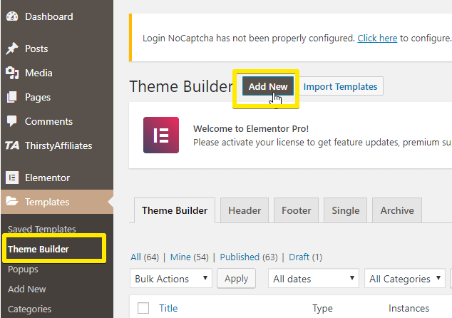
In WordPress dashboard, click Theme Builder > Add New.
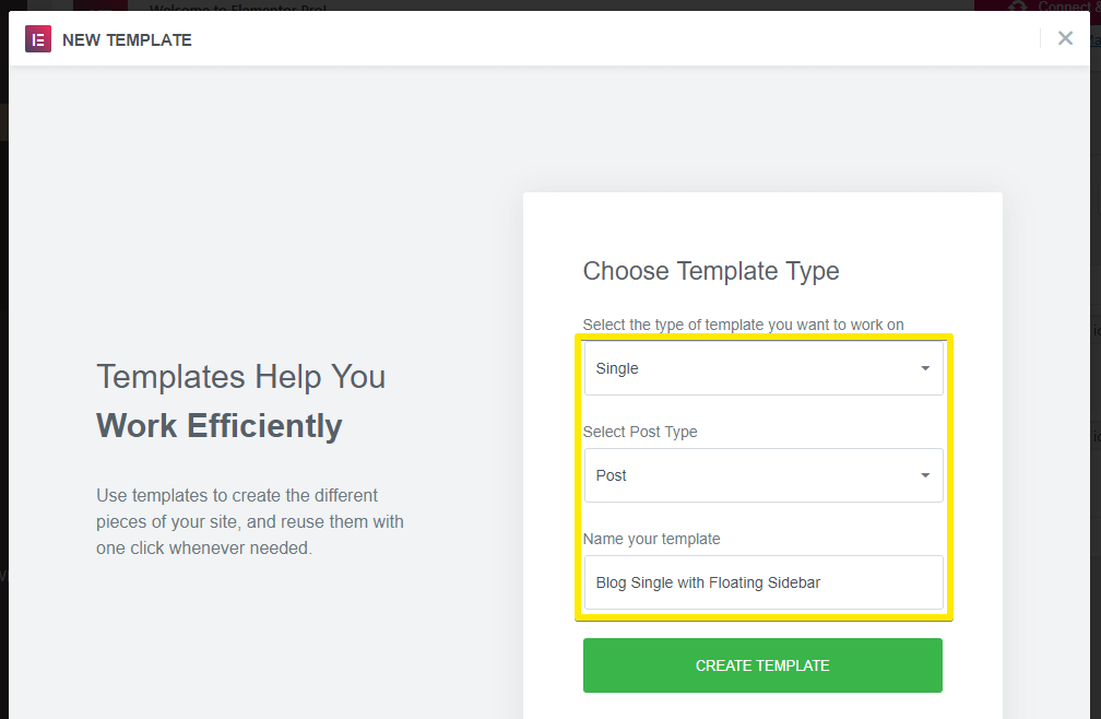
Next, choose the Single template, Post as Post Type and a type a name for your template. Just pointing this out in case you are unaware of this feature: Theme builder allows to design a template from scratch that exactly fits your needs. To design the single post template is just one of many ways to use the theme builder functionality of Elementor Pro. I.e., here on Fresh van Root.com, the templates for
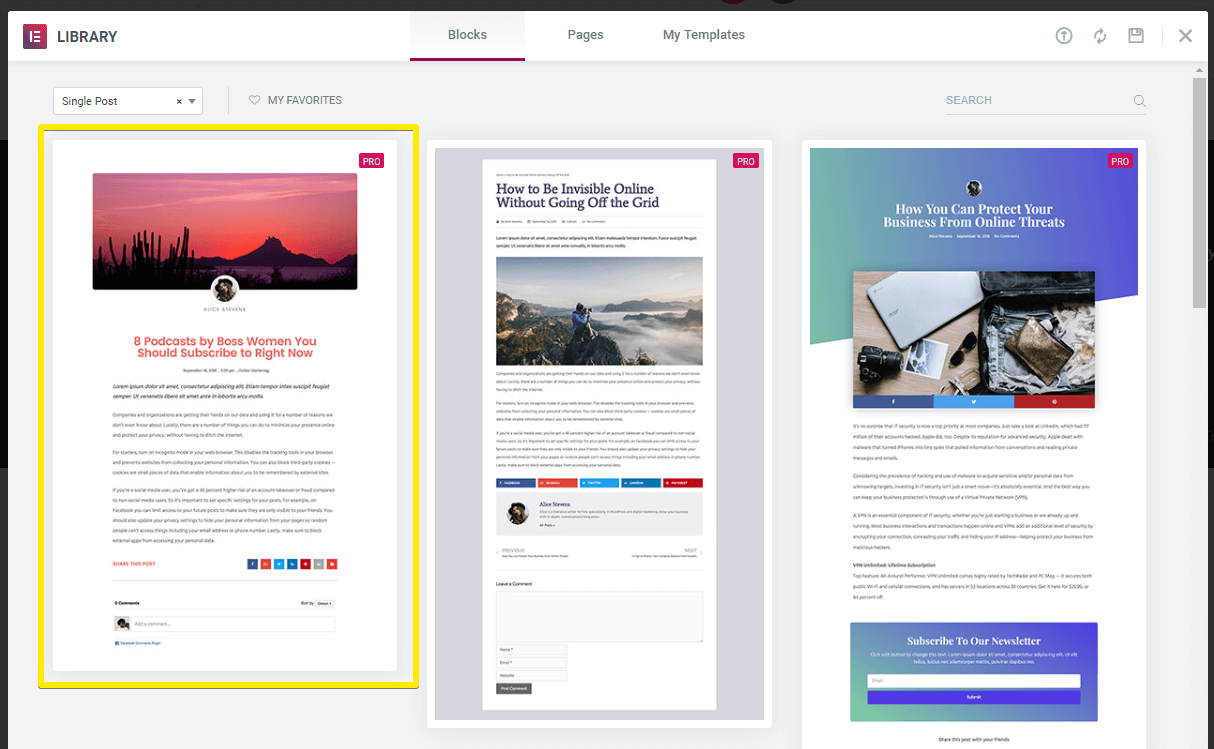
For this demo, we will choose the first template provided by Elementor. Don’t have Elementor installed yet? You can also take a look at the provided templates in the official Elementor blog.
Customize your single post template
Now duplicate the column, delete all content within it (but keep the inner section). Then customize the column width to your needs.
Add the sidebar content
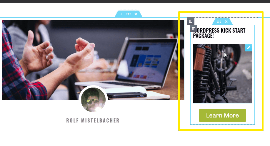
Now, add all the content you want your floating sidebar to hold. For this demo, we add a few elements to feature our WordPress Kick Start package.
Make the sidebar column sticky
Now the most important step: Enable the sticky property on the inner section of your sidebar column. Why an extra inner section? Because you don’t have the sticky property on column level, it is only available on section level or specific elements (you could also make one specific promotional image sticky, instead of a whole inner section).
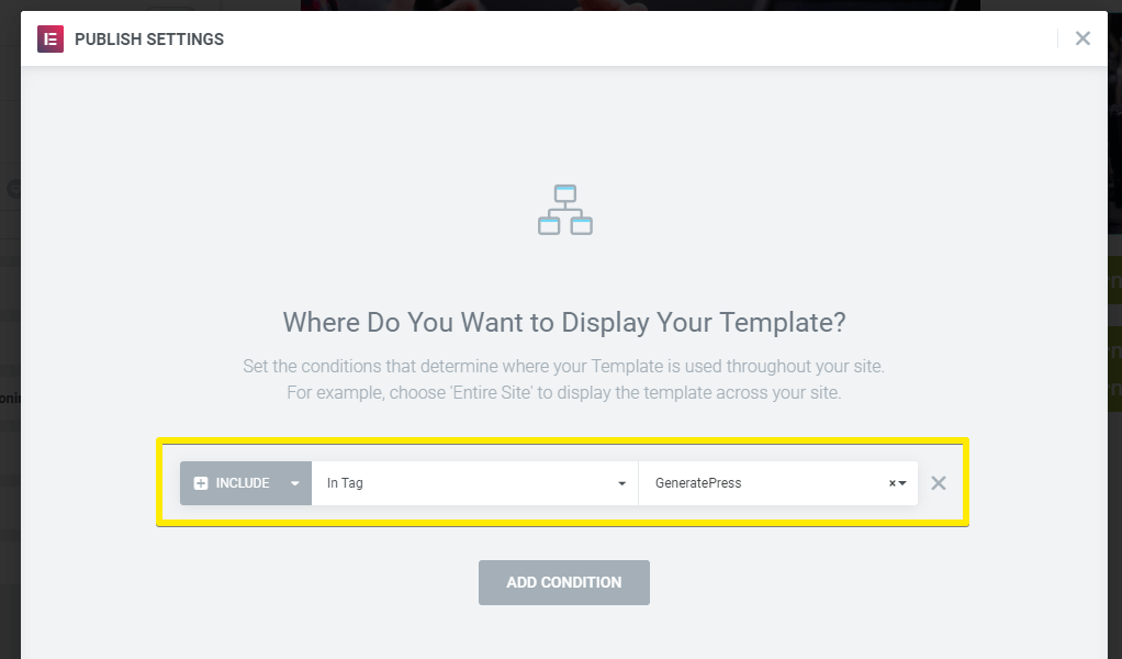
Setting display conditions
The next step is to decide which posts this template should be used for. That’s again a very powerful Elementor feature: You could create post templates for different use cases, i.e.
- a template for specific authors (i.e. a different layout for guest bloggers)
- categories or tags (show a specific promotion for posts in the category X)
- in a specific format (i.e. for photo blog posts)
Click the little arrow next to the green publish button to access display conditions. For this
Publish and test!
Now publish your template and browse to a blog post meeting your display conditions. The floating sticky sidebar should work!
Bonus Content
- Keep the blog single template unpublished as long as you haven’t finished the design (you don’t want to confuse your readers with a changing blog design). Use the display conditions settings to test your blog layout on a live post (i.e. choose very specific tags to match only one post).
- This how-to focused on blog single templates and creating a sticky blog sidebar, but keep in mind you can create a sticky sidebar (or content) on any page created with Elementor, and on any page template, you want!
- Be cautious of over-using this feature, it makes maintaining your site and content more complicated, and spend extra time configuring and testing the responsive settings.
This site is created using Elementor and GeneratePress. We published a few posts about how we did it!
In Part 1 we provided