

When you start creating a web page in Elementor, you will need to fully understand the concept of padding and margins. Elementor allows customization of those parameters on several levels.
Never heard about Elementor? Start here.
Padding and margin settings are not only necessary to make your page layout on all devices perfect, but also have a huge impact on the look & feel of your page.
In this post, I am going to outline the basic concept and share an example to make it easy to understand.
What is the difference between Padding and Margin?
A page built in Elementor is structured in
- Sections
- Columns
- Widgets with content
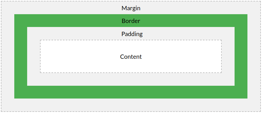
The margin controls how much space is outside the border of the element you are editing.
The padding controls how much space is inside the border and the content of the element you are editing.
This image from w3schools.com explains it very well.
Lets create a simple example in Elementor.
- Section
- Column
- Content
- Column
All 3 elements could have padding and margin, but in this first example, we are only adding padding and margin on section level.
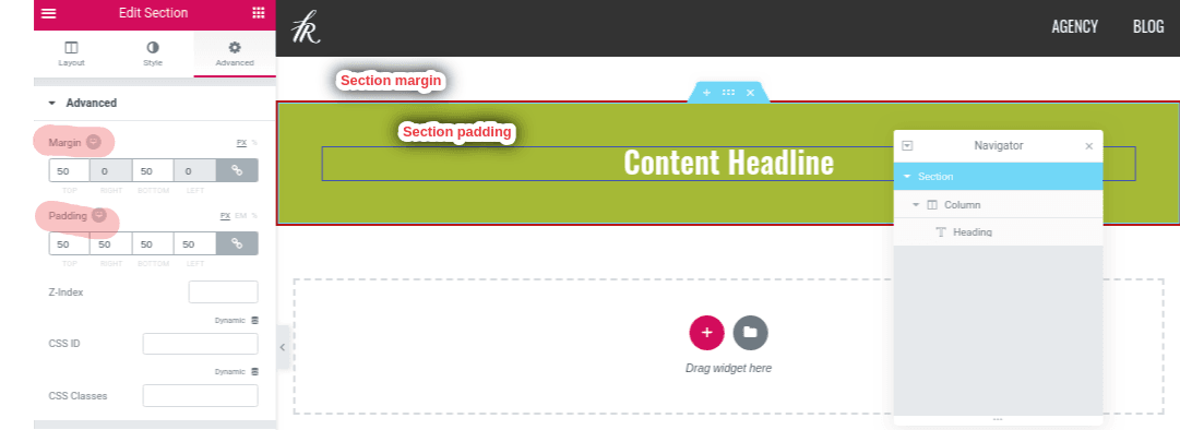
Both the column and the headline element in the screenshot above do have zero margins and padding. In the next step we make this layout more complex by adding 2 more columns.
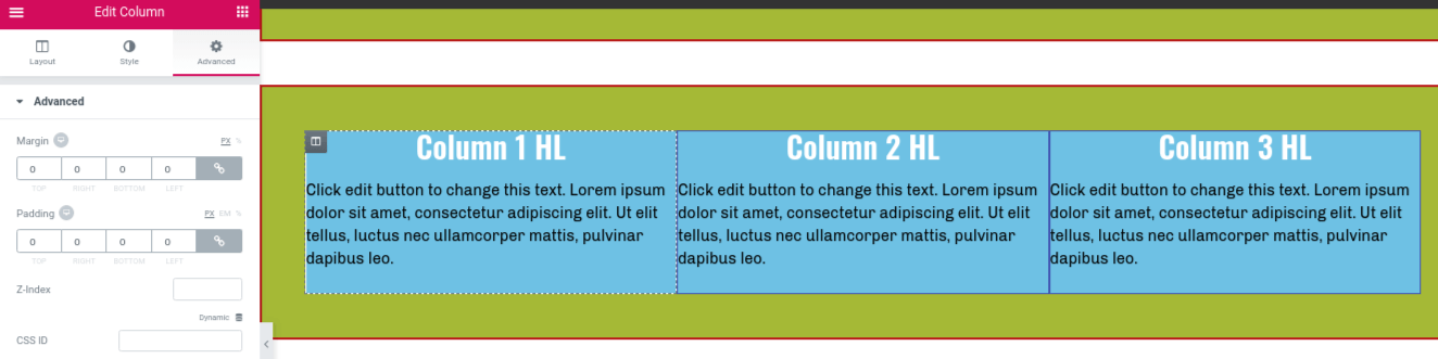
This is the layout without any margin or padding on column level.
The problem with this layout: Without margin and padding on column level it does not look very good. Let’s add some space between columns and between content and the column border.
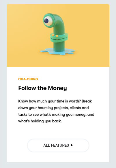
This looks better. Now take a look at something more complex. I recently discovered the website of toggl.com, a web app for time tracking a freelancer I work with uses.
Their website is a great example you could try to rebuild in Elementor.
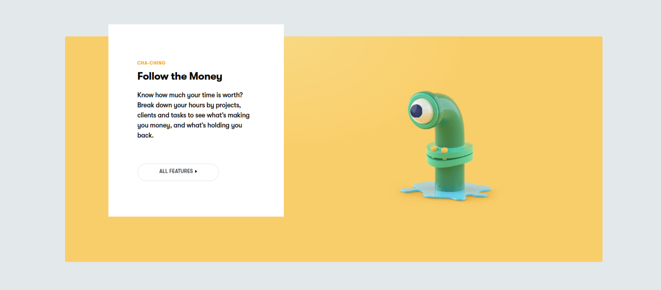
Let’s rebuild this feature section from Toggl with Elementor. The basic layout is pretty simple:
- Section with background color
- A column with background color and inner section
- 2 columns
- Column 1: Headline, Text
- Column 2: Image
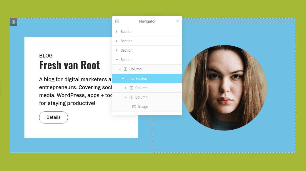
In Elementor, you can set margin and padding for left, right, top and bottom. We need to customize these values for the left column to get a similar look for our section to make it more look like toggl.com.
By setting the values for margin to a negative value you can move the text box outside the section it is within. This is a pretty common design tweak nowadays and easy to implement with Elementor. (How to use Minus Margin – Elementor Docs)
To get the exact same look like on toggl.com for this section you will need to add a border radius on the inner section and the column with the text.

The last step is to tweak the margin value between the text elements (or widget space on column level).
Padding and Margin on Mobile with Elementor
Now switch to mobile and take a look how that looks.
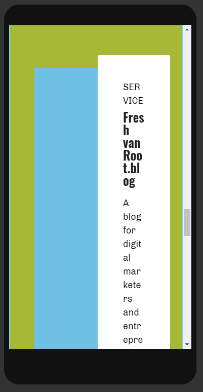
It looks ugly with the default setting from desktop applied. We want to get the same look & feel again from toggl.com.
To accomplish that behavior on mobile in Elementor remove all padding and margin from the inner section and columns. To have a little space on the outside section we add padding in percentage value. Why? on mobile, we want to use as much space as possible (to stretch the content), compared to the desktop, where the content has a boxed layout.
The reverse column responsive setting in Elementor needs to be turned on to get the image displayed first on mobile.
Should you use pixel or percentage value for Padding/Margin?
There are hundreds of articles and discussions online about that. I try my own answer here.
If you going for a full-width design on desktop you might want to work with percentage values for padding and margin. Take a look at this agency website, which is using a full-width design. If you would have a fixed pixel value for the elements on the grid it would not scale to the screen or look awkward.
If you work with percentages instead of pixel values the layout adapts to the screen size. To illustrate this here a quick example again. I am changing from pixel to percentage on the text area and then change the size of the browser window.
As you can see in the video above, as long as the pixel value of -50 is applied to the column holding the text, the position of the white rectangle does not change if I resize the browser window. After changing to percentage -10 and again resizing the browser window, you can see that the white rectangle does adapt and the position is not fixed.
On mobile, I would recommend working with % values most of the time, because you have hundreds of different device resolutions and in most cases, you want to use all of the space available on a smartphone, so you will not work with a boxed content container most of the time.
What about the em value on padding? The value is relevant to the font size of an element. If you have set a default body font size of 18px, and then on a specific text widget a setting of 2em, it will double the font size to 36px. You can reduce the font size by 50% by setting 0.5em respectively.
The benefit of working with em sizes on fonts is that you can change your default font size once and all font sizes across your site are changed at once.
What else you should think about
- Responsive settings: Paddings and margins need to be optimized for all devices (obviously). As I said in previous posts about Elementor, switch often and early on between mobile and desktop when working on your page. This solves frustrations later on
- Consistency: It is important to have the same paddings and margins across your whole site, not just within one page. It adds to your brand’s consistency
- Keep your layout simple: Yes, you can create cool looking things with negative paddings and margins, but keep it simple for the user to digest
- Depending on the product or service you offer your website will be visited from mobile or desktop more often. I.e. we have a client who has 95% of visitors coming from the desktop because they offer a b2b sales software which people only look up during office hours. That might is completely different if you work on a restaurant website or any consumer product or service.
- Think your grid layout through for your site, try to cover all use cases and start working on padding and margin setting only after you have added some real content. Sites often look good with the same lorem ipsum content in every box!
What is Widget Space?
The widget space in Elementor defines how much space is added between content widgets. You can centrally manage that in Elementor settings or on column level.
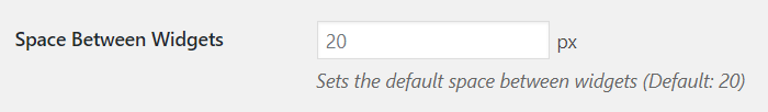
The widget space setting in action on column level:
Don’t confuse widget space with padding and margin.
Conclusion
Padding and margin have a huge impact not only on the layout but on the look and feel on your site. While on desktop huge Padding/Margin makes it easy for a user to consume your site you will need to drastically reduce Padding/Margin on mobile or even hide some elements.
- Fresh van Root runs on Elementor Pro, but all examples in this post can be recreated with the free version to.
- Check our other articles about Elementor.