TL;DR
- Twitter Desktop got a full redesign
- You can try it here: mobile.twitter.com
- It’s already 3 years old
- Will be rolled out to everyone soon
- New profile pages
- New timeline
- New settings
- Bookmarks
- Data Saver
- Night Mode
There have been several changes to Twitter over the last years. The character limit was increased from 140 to 280. The symbol of the Fav was changed from a star to a heart. Replied accounts don’t eat into the character limit anymore. While the iOS and Android apps saw several design updates, the desktop website didn’t change much since 2014. In 2015 the profile pages were redesigned and later the top menu was changed from “Home Connect Discover Me” to “Home Notifications Messages”. But it’s 2019 and a full redesign waits around the corner. Let’s talk about the history of the new design and then take a deeper dive into how Twitter will look like in the future.
#newTwitter started as Twitter Lite (Mobile First, PWA)
Back in April 2017, Twitter introduced Twitter Lite. A faster, lightweight alternative to the full apps. Optimized for low memory devices and spotty mobile connections. It’s a progressive web app (PWA). Basically it’s a website that works offline and online by storing some data on the device. But it’s still a website and does not need an app store to be “installed” or updated. Twitter Lite used the JavaScript library React since the start and still does today. If you are interested in more technical details read this post in the Twitter blog and even more technical medium post by one of the developers.
Twitter Lite replaced the mobile website and is available under mobile.twitter.com. But it was released in several app stores as well. The Twitter Lite app is mostly a browser wrapper for the PWA. In 2018 Twitter for Windows got replaced with Twitter Lite as well. Twitter for Windows was originally introduced in 2015 for Windows 10 and didn’t look like any other Twitter app, but went all-in on Universal Windows Apps (UWP) and it’s design guidelines with live tiles and accent colors. Today it’s just a browser wrapper for Twitter Lite.
Twitter Lite became Twitter Web App
Twitter Lite was kind of a secret tip as it wasn’t available in the European or US app stores. Few used it on their mobile phones and even fewer knew that it worked perfectly fine on desktops as well. In September 2018 Twitter announced that they are testing a new Twitter for the web with a small number of people. People who used Twitter Lite in the past could recognize that the new interface looked exactly the same as Twitter Lite.
More and more people were invited to use Twitter Lite as the default experience on the desktop. When they open Twitter there is little box offering them a sneak peek.
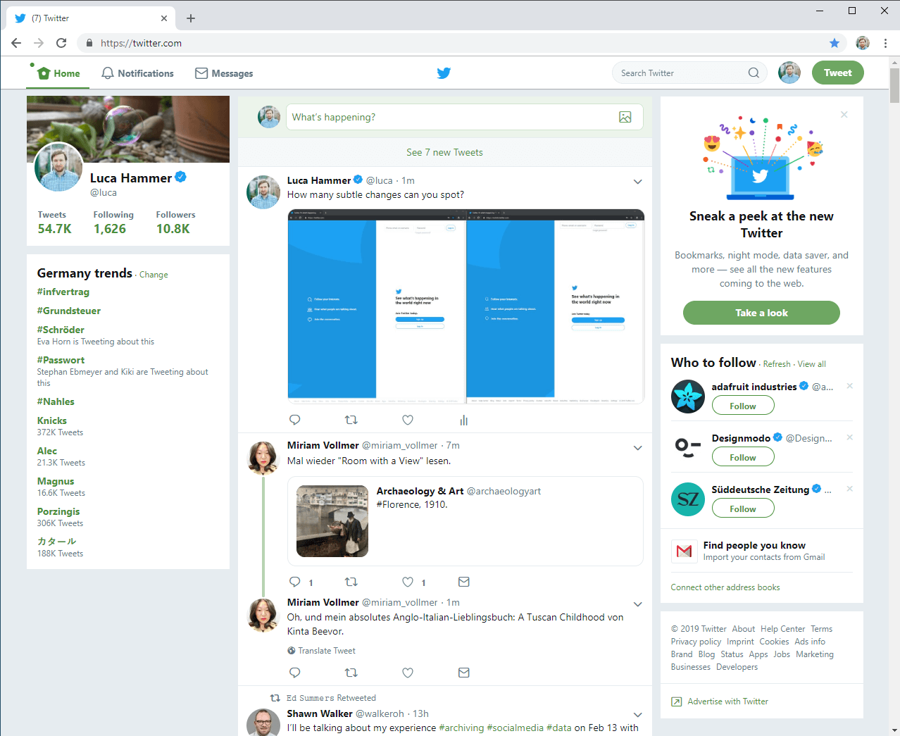
But even if you don’t have that box, you can simply visit mobile.twitter.com and explore #NewTwitter on you own.
While Twitter never called #NewTwitter Twitter Lite, it still was obvious by looking at the source label of the Tweets. Only at the end of January 2018 they renamed “Twitter Lite” to “Twitter Web App”. The “old” desktop web interface is called “Twitter Web Client”. For the rest of the article, I will call #NewTwitter Twitter Web App.
Full Redesign
These aren’t some changes to the CSS but a completely new frontend. Developed from scratch and tested for years. You can see and feel the mobile-first approach. Twitter Web App feels familiar if you have used the Twitter apps. On a small display, you will have trouble distinguishing between the native app (Twitter for Android, Twitter for iOS) and Twitter Web App.

New Twitter Web App 
Android app
If you compare Twitter Web Client (old) with Twitter Web App (new) you quickly realize that they only share the data and some basic structure that makes it easy to find things when you are used to the old interface. It’s similar enough to the old interface by using similar design elements, but it is cleaner. And faster.
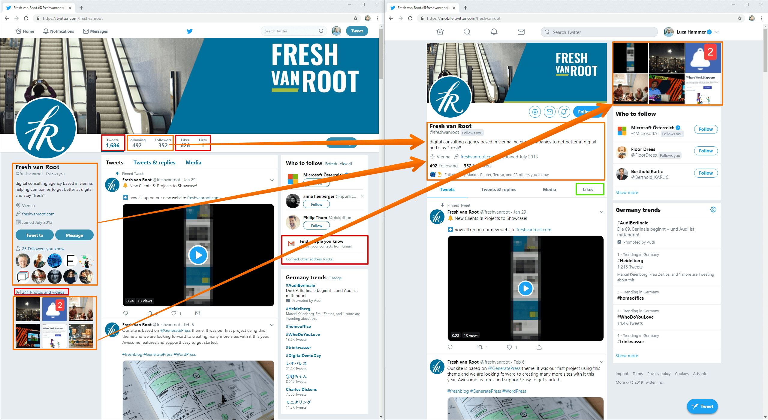
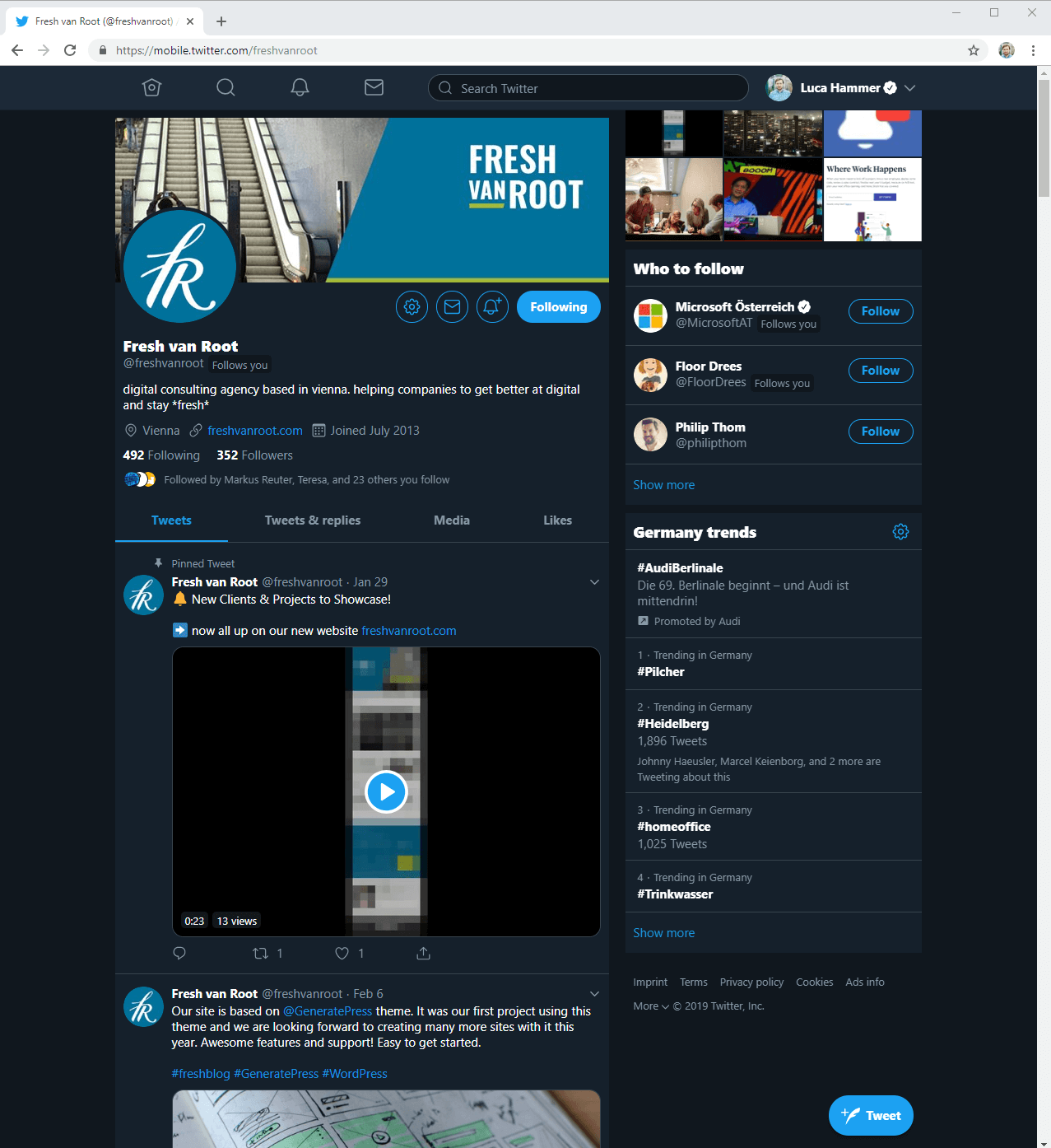
New profile pages

Old Twitter 
New Twitter
The profile page looks like in the mobile apps now. Some things got removed. The number of Tweets, number of Faves (aka Likes) and the number of media uploads. Address book nagging is gone as well. The header got shrunk. Information about the account is nicely grouped together below the header. Following and follow numbers are smaller to express that they aren’t that important. Media was moved to the right side.
When you visit the new profile, you see the avatar and header first. As your focus scrolls down there is the profile info and then the Tweets. The media gets less attention but now includes videos as well.
Few changes to Home Timeline

Old timeline 
New timeline
Like everything else, the home timeline gets reduced from three columns to two. Information about your profile is completely removed. Well, not completely. Now it sits in the new slider menu, which appears when you click on your account on the top right. Menu is now only symbols instead of symbols with text. Search is more prominent. Not only fills the search field all available space, but there is also a new search symbol as well. That is the same as in the mobile apps.
Some smaller tweaks regarding the “who to follow” box and the trends are also coming. The footer doesn’t have a box anymore and several links are now hidden behind a “more” link.
A big change that isn’t visible: The timeline remembers your position and doesn’t scroll on its own. If there are new Tweets, it’s much easier to scroll over them compared to the past when the timeline jumped around when it loaded new Tweets.
Retweets stay bigger. In the old interface images in retweets got reduced to squares. With the new interface, they stay big and provide a consistent experience.
There is a floating Tweet-Button on every page. While you still can use the Tweet-field at the top of the timeline, it’s quicker to use the button. Both open the same overlay. In the old interface, the Tweet-field allowed inputting a Tweet directly while the button in the top menu opened an overlay.

Old compose overlay 
New compose overlay
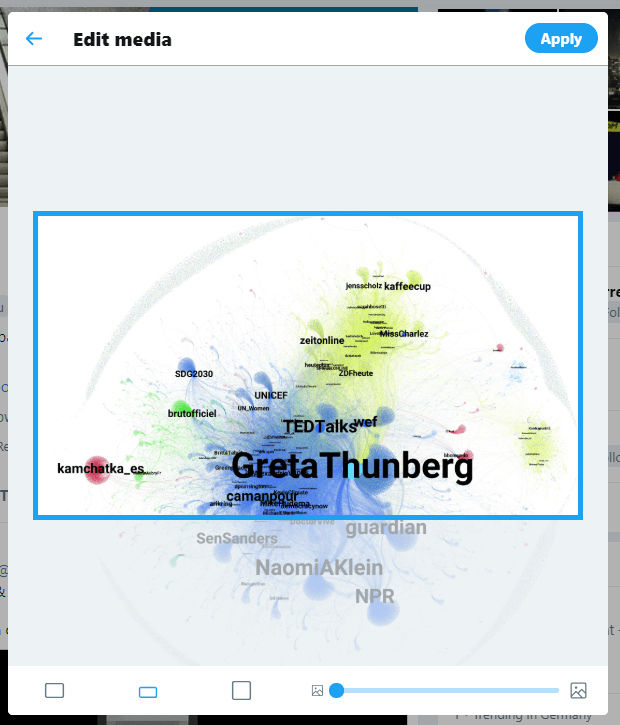
When you upload an image you get basic editing options. While many edit their images upfront it improves the workflow for people that only want to change the size.
Sidenote: While the old Twitter interface only allowed the upload of images up to 2048x2048px, the new Twitter Web App allows up to 4096x4096px. Images will still be transcoded to 85% JFIF quality JPEGs in most cases. PNGs will be transcoded as well, but stay PNGs if the transcoded JPEG would be bigger. Only palette based 8-bit PNGs will always stay PNGs.
Single Tweet View

Old Tweet View 
New Tweet View
Single Tweets aren’t overlays anymore but got their own pages (again). Like every other view, the Single Tweet View is two columns. The old one had one column. Or a single column overlay. The trends moved to the right column as well as the follow button. Besides the follow button the account bio is always visible as well as some accounts that were mentioned in the Tweet or are part of the conversation. Again with account information and a follow button.
Source labels are back. In the early days below every Tweet was the client the account used to publish the Tweet. They are back again. In the example above it’s Twitter for Android. You see it beside the date. That information helps to understand if a Tweet was automated or not.
The DM button got replaced with a multi-functional share button. Pressing it allows you to send the Tweet via DM like in the old interface, add it to Bookmarks or copy the URL (keep in mind that this interface is sometimes used in browsers without a URL bar).

Bookmarks
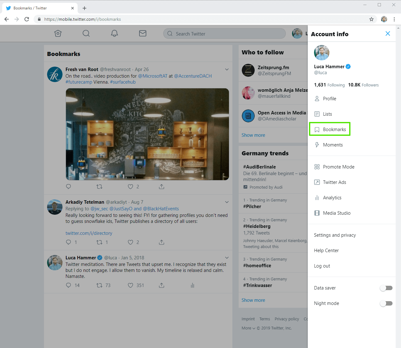
Some people used Faves as bookmarks. But then Fav(orite)s became Hearts/Likes. Bookmarks are bookmarks. They are private and hard to manage. You can access them through the menu and they are simply a list of the Tweets you bookmarked in the order you bookmarked them. You can search through them. You can’t tag them or re-order them. They are just there. Maybe they are useful to you.
Cleaner Settings

Old settings page 
New settings page
The old Twitter settings were a mess. Over time more and more settings were added until there was a list of 15 setting pages. The new settings are grouped together. As a result they are nested, but still easier to navigate.
Data Saver

Without data saver 
With data saver
As mentioned in the beginning, Twitter Web App was once Twitter Lite. A data saver option is a useful option that’s still available. When you activate the option images aren’t loaded at all (URL previews) or with a really low resolution (uploads) and can be loaded with a tap. I wish there was an option to not load images at all like in the native mobile apps, but this is better than nothing and needs not only less data but reduces the visual stimulation as well to make it easier to focus on the text.
Night mode
If you prefer a darker look or don’t want to disturb others while tweeting in bed, night mode is for you.
If you don’t like it, try Tweetdeck
I love the new Twitter interface. It’s neat and fast. But I understand that it isn’t for everyone. Twitter made it impossible to develop third party clients that offer the same functionality as the official interface. While there are several options for marketers and companies like swat.io or Hootsuite that help with managing multiple accounts by multiple persons, they aren’t really suited for everyday Twitter consumption. The only real alternative is tweetdeck.twitter.com. It is targeted at power users and allows some customization to create a Twitter experience that suits you.